This is a finished piece of a still life study. The focal area is the iris in front of the vase. It is more defined than the rest of the painting. It has more contrast, sharper edges and description. The rest of the irises are soft and not has defined. The background, shadow, vase and tabletop does not distract you. Your eyes should go the focal point. The front iris.
When adding color, you need to stand back at a viewing distance to ensure the color is showing but not in a sweet way - IE having too much chroma. You dab a color and step back. If it is readable and works, then you continue with that color. If not, mix, dab and try again. This is the same method with changing value.
I did not start with a transparent wash. Instead, I mixed my colors and carefully loaded my brush with paint and used short brush strokes. This allowed me to "layer" the color. This means you must think and be precise with each stroke so you can leave the colors underneath. It takes a lot of concentration.
Great lesson. Great instruction.
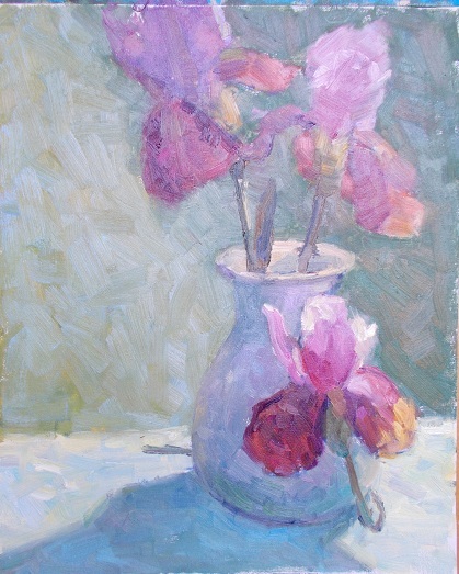 |
| "Irises and Vase Study" Oil On Canvas Sheet |
No comments:
Post a Comment